How to Choose Wedding Colours That Wow

Choosing your wedding colours really boils down to a few simple starting points: draw inspiration from your season, venue, and personal style. From there, you can build out a gorgeous, cohesive palette by picking one or two main colours, a secondary shade, and a metallic or neutral accent to tie it all together.
Finding Your Core Wedding Colour Inspiration
Deciding on your wedding colours can feel like a monumental task, and in many ways, it is. This single choice sets the entire visual tone for your celebration, influencing everything from the flowers and stationery to bridesmaid dresses and table settings.
But this process should be exciting, not stressful! The key is to start with what feels genuine and meaningful to you as a couple. Your inspiration doesn't have to come from a pre-made wedding palette you find online.
Look around you. Is there a piece of art in your home you both absolutely adore? What about the colours from a memorable holiday, like the deep blues and crisp whites of a coastal getaway or the earthy tones of a countryside retreat? Even your own wardrobe can offer clues.
So, Where Do You Start?
The best way to get a handle on all those fleeting ideas is to pull them together in one place. A physical or digital mood board is a brilliant tool for this. Start collecting images, fabric swatches, and paint chips that just feel right.
Don't overthink it at this stage; just gather things that catch your eye. Before you know it, you’ll start to see beautiful patterns emerging.
Remember, this isn't just about picking colours; it's about defining the atmosphere you want to create. Your palette should be a true reflection of your love story, right from the very first invitation.
Stuck for ideas? Here’s a quick rundown of some fantastic places to find your initial colour inspiration, especially for a UK wedding.
Where to Find Your Wedding Colour Ideas
| Inspiration Source | What to Look For | Example Palette Idea |
|---|---|---|
| Your Venue | Architectural details, wallpaper, surrounding landscape, existing decor. | A historic manor with dark wood panelling might inspire a rich palette of navy, gold, and cream. |
| The Season | Natural light, seasonal flowers, the overall mood of the time of year. | An autumn wedding in the Cotswolds could feature warm rust, deep plum, and dusty rose. |
| A Shared Memory | A favourite holiday spot, the place you got engaged, a piece of art. | A proposal in the Scottish Highlands could lead to a palette of heather, slate grey, and moss green. |
| Fashion & Art | Your favourite outfits, a painting you love, interior design trends. | A love for classic fashion might suggest a timeless black and white theme with a pop of scarlet red. |
Looking at these sources should give you a strong foundation to build upon, ensuring your colours feel personal and authentic to you.
Weave in the Details
Once you have a general direction, think about how these colours will translate into specific wedding elements. This is where the magic really happens.
For instance, rich velvet textures in a deep emerald or burgundy can add a truly luxurious feel, especially when tied into your decor with ribbons and bows. To learn more about how different materials can carry your theme, check out this fantastic guide to wedding ribbons in the UK. Small details like these are what truly bring a colour scheme to life, making it feel intentional and beautifully curated.
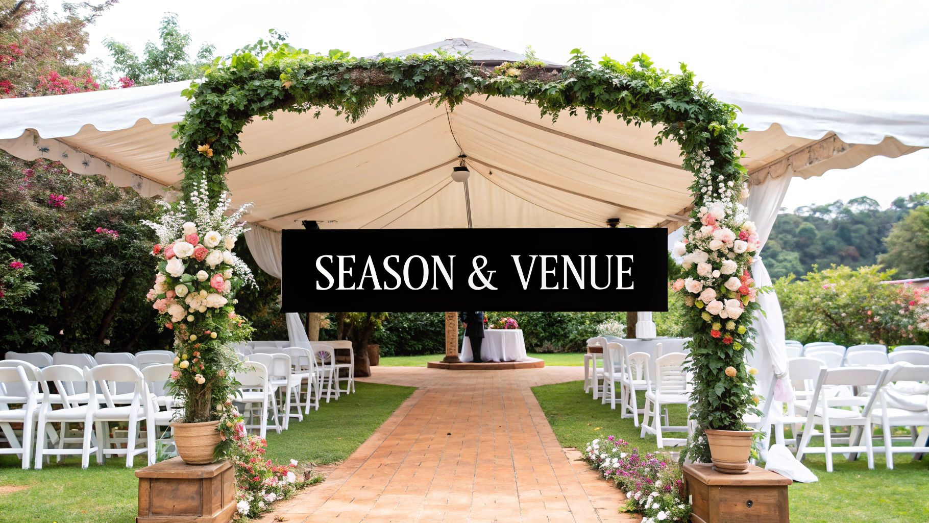
Working With Your Season and Venue
Before you fall head over heels for a Pinterest-perfect colour palette, take a look at two of your biggest clues: your wedding date and your venue. These aren't limitations; they're your greatest assets. Fighting against them is a recipe for a design that feels a bit off. Instead, let them guide you towards a look that feels natural, cohesive, and completely intentional.
Leaning into the time of year is a classic approach for a good reason. Each season in the UK brings its own unique personality and, crucially, its own light. This can have a huge impact on how colours appear on the day.
- Spring: Think about that fresh, delicate energy. This is the time for soft pastels like blush pink, lilac, and duck egg blue, which look incredible paired with creamy whites and new-growth greens.
- Summer: Go one of two ways. You can either embrace the vibrant, saturated hues of a long summer day with bold corals and sunny yellows, or channel the timeless romance of a garden party with softer shades of sage green and dusty rose.
- Autumn: This season practically begs for rich, moody schemes. It’s the perfect moment for warm tones like burnt orange, deep burgundy, and mustard yellow, all grounded by earthy browns and deep greens.
- Winter: Create a truly magical, cosy atmosphere with deep jewel tones. Think emerald green and sapphire blue, brought to life with the twinkle of metallic accents like silver or gold for a festive feel.
Audit Your Venue’s Colours
This is a step I tell all my couples they absolutely cannot skip. Before you set your heart on any colours, you need to do a ‘colour audit’ of your venue. Many spaces have strong, permanent design elements that will either sing in harmony with your scheme or clash horribly.
Grab your phone and get ready to take some pictures. You need to look closely at the details that won't be changing. Pay attention to the colours of the carpeting, the curtains, any wall art, and even the upholstery on the chairs. A hotel with a bold, burgundy-patterned carpet might not be the best backdrop for a light and airy pastel theme, but it would look absolutely stunning with a rich, dramatic palette.
A rustic barn with gorgeous warm wooden beams naturally lends itself to earthy tones and organic greens. On the other hand, a chic city hotel with cool marble floors might inspire a more modern palette of black, white, and gold. The secret to a polished, harmonious wedding design is always to work with these fixed colours, not against them.
Using Natural Greens for an Elegant Palette
Green has really cemented its place as a cornerstone of modern wedding design, and it’s not hard to see why. It’s so much more than just a colour; it acts as a wonderfully versatile neutral. It brings a sense of calm, elegance, and a direct link to nature, making it a perfect match for so many beautiful UK venues, from rustic barns to grand country estates.
The true beauty of green is its incredible range. You can create completely different atmospheres just by shifting the shade you build your palette around. It all comes down to the feeling you want to create on your big day.
It's no surprise that shades of green are dominating wedding colour choices right now. Recent data shows that sage green is the most popular, chosen by 12% of couples, with forest and emerald green hot on its heels. This really points to a collective desire for calming, nature-inspired themes. You can read more about what's trending in the 2025 wedding report from Bridebook.
Building Your Green-Based Palette
Picking your main shade of green sets the tone, but the real magic begins when you start pairing it with other colours. This is how you create a palette that feels layered, thoughtful, and completely you.
- Sage Green: Soft, romantic, and endlessly popular. Sage pairs beautifully with dusty rose, creamy ivory, and light grey for an airy, timeless feel.
- Emerald Green: If you're after a touch of drama and luxury, emerald is a fantastic choice. It looks absolutely stunning next to rich gold accents, classic black, and deep burgundy.
- Forest Green: This deep, earthy shade is just perfect for crafting a moody, enchanting atmosphere. Complement it with warm wood tones, burnt orange, and the soft glow of candlelight.
- Eucalyptus Green: With its distinctive silvery-blue undertones, eucalyptus works wonderfully with navy, crisp white, and touches of silver for a sophisticated, contemporary look.
When you're thinking about how to choose wedding colours, try to see green as a texture, not just a colour. Bringing in natural foliage like eucalyptus, trailing ivy, or ferns is a brilliant and cost-effective way to fill a space and make your chosen palette feel organic and effortlessly chic.
Ultimately, using green as your foundation gives you a wonderful sense of cohesion that can tie your whole day together. It beautifully connects your indoor decor with the natural surroundings of your venue, creating a seamless visual experience for you and your guests.
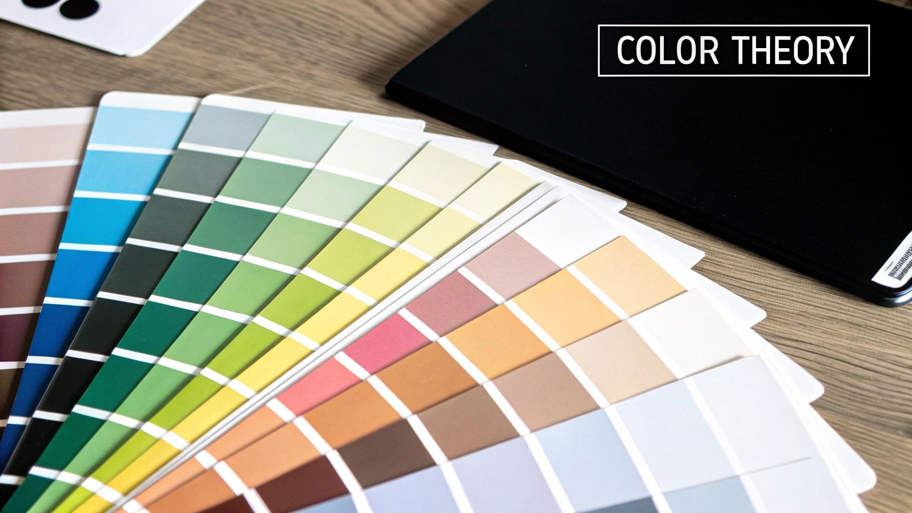
Applying Colour Theory for a Cohesive Look
So, you’ve picked your core colours. Now what? How do you transform them from a few nice ideas into a polished palette that looks chic and intentional? This is where a little bit of design know-how makes a world of difference. Don't worry, you don’t need an art degree—just a few simple principles to guide your choices.
Think of basic colour theory as your secret weapon. It’s the key to combining shades in a way that’s pleasing to the eye, ensuring your wedding design feels cohesive rather than chaotic. It's essentially a recipe for creating a beautiful visual experience for you and your guests.
Start with Simple Colour Schemes
Two of the easiest and most effective schemes to work with are complementary and analogous. Getting your head around these will give you a fantastic starting point.
- Complementary Colours: These are simply opposites on the colour wheel, like a classic blue and orange or a striking purple and yellow. This pairing creates high contrast and a really vibrant, dynamic look. It's perfect if you want your wedding colours to make a bold statement.
- Analogous Colours: These shades sit right next to each other on the colour wheel—think of the gentle flow between blues and greens. This approach results in a much more serene and harmonious feel, creating a subtle, flowing transition between your chosen hues.
Use the 60-30-10 Rule for Balance
This is a classic designer’s trick for a reason: it works! Following the 60-30-10 rule is the simplest way to create a perfectly balanced palette where no single colour feels too overpowering. It works by assigning a specific role and weight to each of your chosen colours.
The 60-30-10 Rule Breakdown:
- 60% Main Colour: This is your dominant shade, the one that sets the overall tone. You'll see it in the biggest elements, like your bridesmaid dresses, table linens, and the larger floral installations.
- 30% Secondary Colour: This colour is there to support your main hue. You'll use it about half as much, woven into things like smaller floral arrangements, stationery details, or the groomsmen's accessories.
- 10% Accent Colour: Here’s where you add that pop of personality! This colour should be used sparingly for high-impact details. It’s often a metallic like gold or silver, or a bold shade that appears in smaller touches, like the ribbon on your wedding favours. When you’re ready, you can easily shop for ribbons by colour to find the perfect accent shade for your vision.
The visual below shows how this process comes together, starting from your overall style and flowing down to your primary and accent colours.
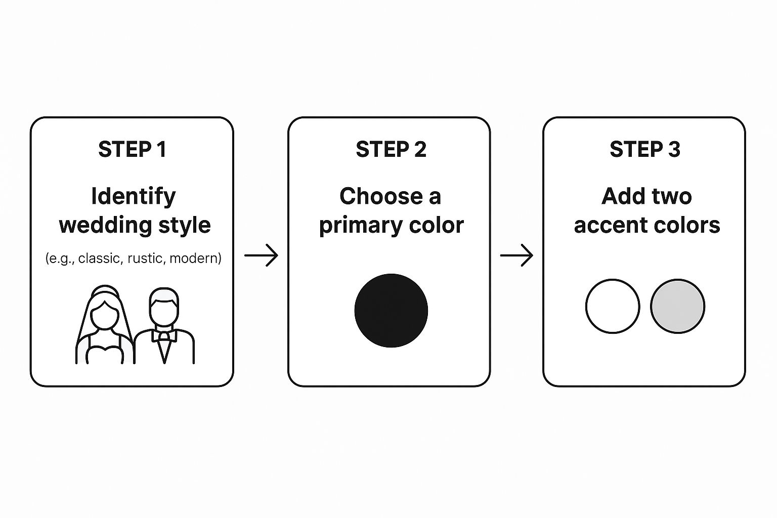
This simple flow shows that choosing your colours isn't random; it starts with your overall style, which then helps you select a main colour and, from there, your supporting accents. By following this structure, you'll create a palette that feels both deeply personal and professionally designed.
Making a Statement with Bold Colour Palettes
While soft pastels will always have a timeless romance about them, I’m seeing more and more modern couples wanting to inject a real sense of personality and energy into their celebration. This is where bold, expressive colour palettes truly get their moment to shine, letting you create a day that feels vibrant, memorable, and uniquely you.
Choosing bolder colours is a fantastic way to make a statement. It’s about thinking beyond the conventional and considering the impact of rich, saturated hues. These powerful colours can completely define the atmosphere of your wedding, transforming a space and delighting your guests with an unexpected and confident aesthetic.
Of course, the key to pulling off a bold palette is balance. You don't want to overwhelm the senses. Instead of painting the entire room in a single strong shade, the trick is to use these impactful colours as powerful accents that guide the eye and create stunning focal points.
How to Balance Bold Colours
One of the most effective ways to choose wedding colours that are both bold and beautifully balanced is to use them strategically. Rather than a wash of colour, think in terms of pops and highlights.
- Tablescapes: Imagine burnt orange napkins sitting against crisp white linens, or maybe deep terracotta charger plates that ground the whole setting.
- Florals: Ask your florist to weave in standout blooms in rich jewel tones. Let them be the stars against a backdrop of softer supporting colours and plenty of lush greenery.
- Attire: A velvet blazer in emerald green for the groom or vibrant, mismatched bridesmaid dresses can add stunning visual interest without ever feeling chaotic.
This approach ensures your wedding feels energetic and stylish, not over-the-top. It’s about creating moments of impactful colour that reflect your personalities and leave a lasting impression on your guests.
The good news is that current trends fully support this expressive approach. Wedding colour palettes are shifting towards vibrant hues like burnt orange, lime green, deep lavender, and coral pink. There's also a real embrace of mismatched palettes and colourful wedding party attire, which gives you so much creative freedom.
To get a feel for what’s popular right now, you can explore the latest UK wedding trends on Hitched. This move towards bolder choices gives you the perfect excuse to create a celebration that is a true, authentic reflection of your unique love story.
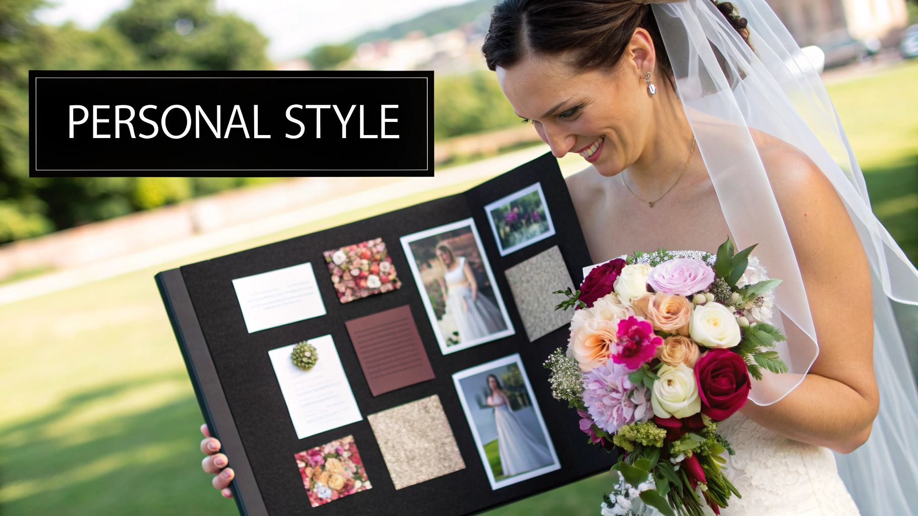
Bringing Your Wedding Colours To Life
With your beautiful palette finalised, the really fun part begins: weaving your colours into the very fabric of your wedding day. This is all about creative execution and clear communication, making sure your vision comes to life in every single detail.
Your suppliers—especially your florist, stationer, and cake designer—are your creative partners in this. To avoid any "shades of grey" moments, give them physical swatches or a detailed digital mood board. Showing them the exact shade of dusky rose you've fallen for is so much more effective than just describing it. It gets everyone working from the same visual script.
Creative Colour Application
Think beyond the obvious. Where else can your colours make an appearance? A signature cocktail tinted to match your accent shade, or even atmospheric lighting that washes the room in a soft, warm glow, can have a massive impact.
It’s often the smaller details that pull everything together beautifully. The groom's buttonhole, for instance, is a perfect little spot to echo the main floral colours. You can also find an enormous variety of wedding ribbons to wrap bouquets and decorate favours, tying your whole theme together with gorgeous texture and colour.
This is also a fantastic place to lean into current trends. We're seeing green shades continue to dominate, tapping into that love for rustic, natural charm. This is happening alongside a rise in mismatched bridesmaid dresses and even coloured wedding attire, showing a real move towards more personal, flexible celebrations. You can find out more from these popular UK wedding statistics on Party Houses.
Allowing your bridesmaids to choose different dress styles within your palette not only looks modern and visually interesting but also ensures they feel comfortable and confident. It's a wonderful gift to them and a thoughtful approach that makes the day feel truly personal and cohesive.
Got a few lingering questions about choosing your wedding colours? You're not alone! Let's clear up some of the most common queries we hear from couples.
How Many Colours Should a Wedding Palette Have?
It's tempting to want them all, but a good rule of thumb is to stick to three to five colours. This gives you enough variety to create depth and interest without making your décor feel chaotic or overwhelming.
A brilliant design trick to keep everything balanced is the 60-30-10 rule. It’s surprisingly simple:
- 60% of your design should be your main colour.
- 30% is dedicated to a secondary, supporting shade.
- 10% is for one or two accent colours—this is often where you can bring in a metallic or a bold, surprising pop of colour.
Can I Have a Black and White Wedding?
Absolutely! A black and white colour scheme is the definition of timeless elegance. It’s chic, formal, and creates a wonderfully dramatic look all on its own.
Want to add a little more personality? A classic monochrome base is the perfect canvas. A single accent colour—think a pop of deep red, rich emerald green, or a glittering gold—can elevate the whole theme without taking away from its classic feel.
What if My Partner and I Disagree on Colours?
First off, don't panic. This is incredibly common! The best way forward is to start separately. Each of you should create your own mood board, pulling images you’re drawn to without overthinking it.
Once you’re done, sit down together and look for common ground. You might be surprised! Maybe you both pinned images with moody, atmospheric tones, even if one of you leaned towards deep navy and the other preferred forest green. Instead of getting stuck on specific shades, focus on the overall vibe you’re both after, whether that's warm, cool, or vibrant. That's where you'll find a compromise you both genuinely love.
At Ribbons4u Ltd, we know that finding the perfect ribbon is that final, essential touch that brings your entire wedding vision to life. From rich satins to plush velvets and classic grosgrains, explore our extensive collection to find the exact shades for your palette. Visit https://ribbonsforyou.com to find your perfect match.


 Facebook
 Twitter
 Pinterest